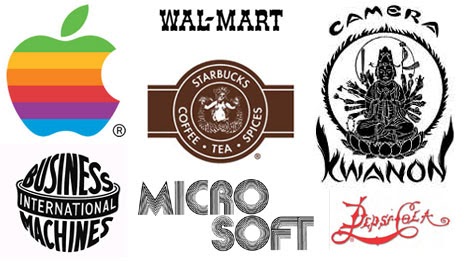
A logo is a visual representation of a brand. That is its sole purpose. They exist in 5 different types: monograms, symbols, combination marks, wordmark, and emblems.
Monograms are mainly typographic and they are symbols that use the initials or first letter of a company. (CNN, KFC, HP, IBM). Symbols are abstract or stylized images that represent a company in a simple manner with the goal of being memorable. (Nike, Target, Mercedes-Benz, Apple). Combination marks combine a wordmark and a symbol with the purpose of using both elements together or separately depending on the application. (Lacoste, Amazon, Microsoft). Wordmark or Logotype are styled typographic images that depict the name of a company or brand. (Google, Disney, FedEx). Emblems show typography within a symbol or icon and these are usually seen on badges, seals, and crests. (Starbucks, Harvard, NFL)
These 5 different types of logos could be further grouped into two main types just like everything on this planet: the amazing ones and the terrible ones. We see amazing logos all the time (Facebook, Google, CNN, CocaCola, FedEx) so there’s a somewhat fair understanding of what a good logo should look like, however, what makes a terrible logo?
1. Irrelevant Symbols
Symbols represent a brand in a visual way and they play a vital role in adding value to a brand’s identity. When you see a bitten apple on a device, 4 interlocking circles on a car, or a Swoosh on footwear, you instinctively know these brands without having to see their names. All these symbols have meanings or stories that are associated with the brand. Former Apple executive Jean Louis Gassée called the Apple logo “the symbol of lust and knowledge.” (Remember the tree of knowledge of good and evil in the Garden of Eden?) The apple logo symbolizes our use of apple computers to gain knowledge and also enlighten others. Janoff, the designer of the logo, incorporated the “bite” so that people would know that it represented an apple and not a cherry tomato. The company could also market it with a nerdy tone with the play on words (bite/byte) which is a clever reference for a tech company. So, when coming up with a symbol for your logo, avoid using symbols that have no relevance or abstract allusion within the industry of your brand, for example, using an electric cable to represent a toothpaste brand. Rather, think of its association with products or your target audience within the industry of your brand and let it reflect the story of your brand.
2. Poor visibility at smaller sizes
Logos go on different surfaces depending on the needs and deliverables of your brand. They could go on merchandise, vehicles, luxury items, or even stationery and due to this, logos need to be scalable. Most brands require business cards and letterheads (stationery) and these surfaces require logos to be seen clearly at a very small scale. Unfortunately, logos with so much detail do not provide room for this. When the scales of these logos are reduced, the details disappear and sometimes, they make the symbols look like something else other than an intended representation of the logo. Therefore, always think “Less is More” when designing details within your logo. You don’t want people thinking that your logo is a monkey when the scaled-up design is a leopard.
That’s all for now. Stay tuned for more aspects of a terrible logo in my next blog. Thanks for reading.
- The Art of Storytelling Through Graphic Design - January 28, 2026
- Why Branding Matters: A Designer’s Perspective - December 30, 2025
- How to Stay Organized While Juggling Multiple Design Projects - December 1, 2025


0 Comments