

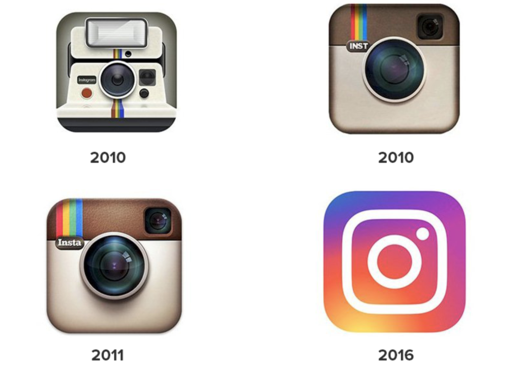
It is always exciting news within the design world whenever a big brand like Instagram introduces us to a change in its identity or creates a new look. Sometimes, it provides a breath of fresh air for the brand, and other times the air within the rebrand is made stale. Audience reaction plays a huge role in this and could either make or break the brand’s loyalty for some time. The interesting part of a rebrand is how the audience gets used to it after a couple of months and it almost seems like the brand didn’t have a refresh because the world forgets its previous look. Instagram faced this dilemma in 2016 when it received a lot of backlashes online for its rebrand (probably the biggest backlash ever for a rebrand) and today, it is exciting to see that they just introduced a brand refresh a couple of days ago. This refresh includes changes in its typeface (see my last blog to learn about what a typeface is), layout, and color.
Beginning with the least significant change, the Instagram icon has an updated color within its gradient. At first glance, it might not be that obvious but after a closer look, you’ll notice it has more vibrant tones within the gradient. The use of vibrant colors within the new gradient was “to make it feel illuminated and alive, and to signal a moment of discovery”. The gradient was designed by London-based digital artist Rose Pilkington who used a 3D modeling process to create this look. People have been sharing responses to the new icon for a few days now and they have been quite interesting. “I’m going to have to reduce my screen brightness for that,” one Twitter user complains. Also, users have shared screen recordings of iOS having issues with the new icon – when closing the app, the icon appears to judder between the old and new design. I find this cool and now it causes me to think about what if the gradient swirled within the logo when the app is closed? I’ll probably have to patent this idea for a lot of money.
![]()
The introduction of a new layout might not be a significant change but if you have a passion for Design you might notice a couple of things. For a brand that displays most of its information in varying aspect ratios, the layout is crucial and in this rebrand, Instagram has introduced a layout that is simple, flexible, and adaptive. It was designed with the ideal user in mind because it places content as the main priority through the use of full-bleed images providing “maximum attention to content”. We now have a grid in motion where type and image come together compositionally to create dynamic layouts. They also move freely making room for experimentation within different aspect ratios.
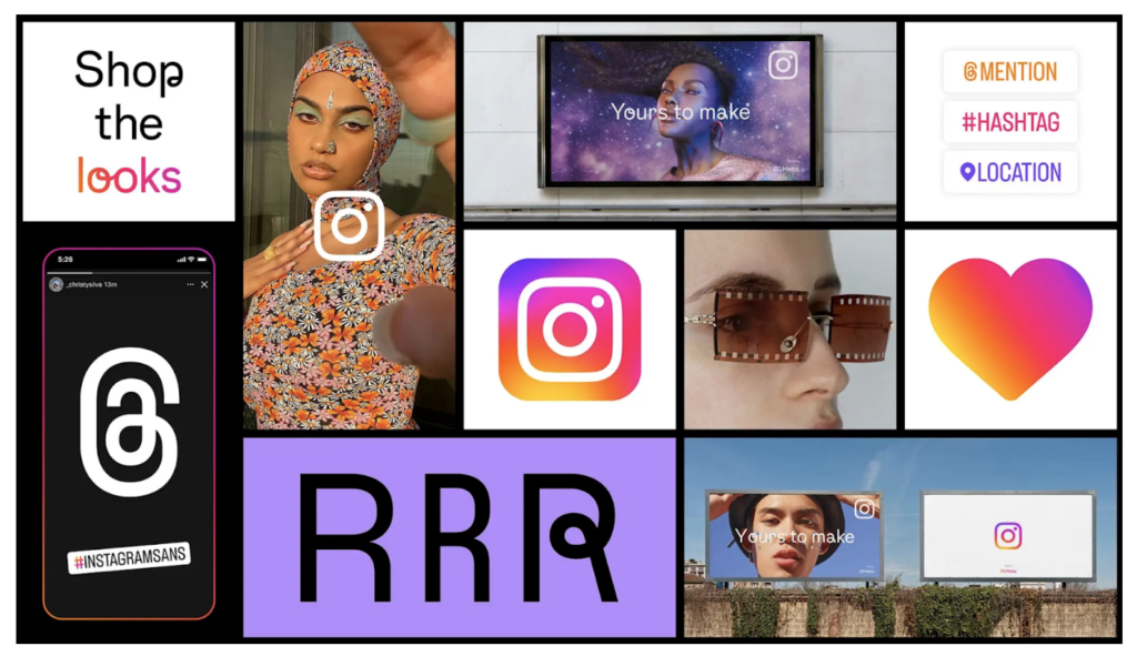
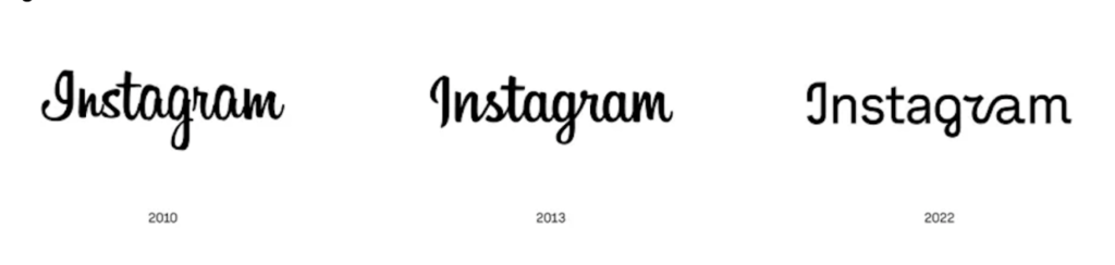
Instagram now has a new typeface called Instagram Sans and this is probably the most significant change within the rebrand. Instagram Sans was designed with the platform’s heritage in mind and it reflects the shape of the glyph and their commitment to simplicity and craft. The typeface was inspired by a perfect square and perfect circle which they like to call a “squircle” and it was designed to improve accessibility. The brand went to the extent of partnering with language experts around the world to ensure this typeface was adapted to the global scripts including Arabic, Thai, and Japanese and now, creators can fully express themselves in any language they chose. This clever partnership also provides the typeface with the inclusion of multiple global scripts and a contemporary remix of grotesque and geometric styles. Members of the Instagram Sans family are Instagram Sans Regular, Bold, Light, Medium, Condensed, and Condensed Bold. I think this is a major update that should have been designed with their last major rebrand in 2016 but better late than never. This typeface does have some amazing features however, the “I” could easily be mistaken for an uppercase “J” and that should probably be redesigned. You can play with the new typeface here and share your thoughts in the comments section below.
Instagram’s goal for this brand refresh was “to celebrate the global community of creators” on the app and they did this through color, layout, and typography. Some of these changes may not be that significant but do you think Instagram was successful with this rebrand, especially without changing any major features within the app? Do you like these changes? How long do you think this brand refresh will last? You can share your thoughts and comments below.

- The Art of Storytelling Through Graphic Design - January 28, 2026
- Why Branding Matters: A Designer’s Perspective - December 30, 2025
- How to Stay Organized While Juggling Multiple Design Projects - December 1, 2025
0 Comments