

Choosing a color palette for your brand is an exciting step in the brand development process, but with so many options to choose from, it can be overwhelming. There are so many colors, shades, and combinations it can be daunting to figure out where to even begin. Luckily, there are tips and guidelines you can use to help choose the best color palette to represent your brand.
Before even looking at colors, it is important to really understand and describe the mood and feeling of your brand. During this stage, it is valuable to gather feedback from your clients or potential clients. You want to be sure you are on the same page as the end-user you are targeting. Is your brand luxurious? Relaxing? Eco-focused? Serious? Playful? Being able to capture and describe the feeling of your brand will help guide you along the path to choosing the perfect colors to represent your brand.
Although color and mood associations are overall uniquely related to individual experiences and personal perception, some patterns can be found in consumer perception of branding colors. For example, red can be associated with feelings or thoughts like warmth, danger, holidays, passion, or fierceness. Many restaurants and makeup companies use red in their branding. Blue on the other hand can be associated with clean, water, the sky, and calm. Many airlines and banks use blues in their color palettes. While not everyone may universally agree with some popular color associations, most cultures have somewhat standard mood associations with colors.
After you nail down the mood of your brand and have a general idea of where you want to start, you can use color theory to decide what type of color scheme you would like to have for your brand. The three most common types of color palates are listed below:
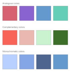
- Analogous colors are any three colors that are side by side in the classic color wheel. For example blue, purple, and red are analogous colors. Usually, one of the three colors takes the main focus in design materials.
- Complementary colors are any two colors that are directly opposite each other, such as red and green, and blue and orange. These opposing colors create high contrast.
- Monochromatic color schemes use tints and tones of the same hue to create variety and depth.
There are some other important technical factors to keep in mind when choosing a color scheme. For example, be aware that choosing colors that are too low in contrast, especially for text, might make your branding material difficult to see. It is also important when choosing colors to be aware that your colors may appear different in print than they do digitally. Make sure to look at your colors on multiple devices and print them as proofs before making final commitments to your brand’s new colors. You can reach out to a graphic designer for help at this stage in the process if help is needed.
If you are not sure where to start, there are plenty of great resources online. Here are a few:
Once you choose your brand’s colors, you can use them as a building block to build your branding guide. A branding guide contains guidelines on how the brand should be represented visually in all public settings. This usually includes a brand’s color palette, fonts, logo iterations, and examples of verbiage.
Sources:
https://govisually.com/blog/color-theory-and-color-palettes/
https://designsystem.digital.gov/design-tokens/color/overview/

- Understanding the Online Marketing Funnel - July 23, 2025
- 5 Simple Ways to Get More Sales from Your Email List - June 24, 2025
- 6 Tips for a Successful Meeting Presentation - May 9, 2025
0 Comments