

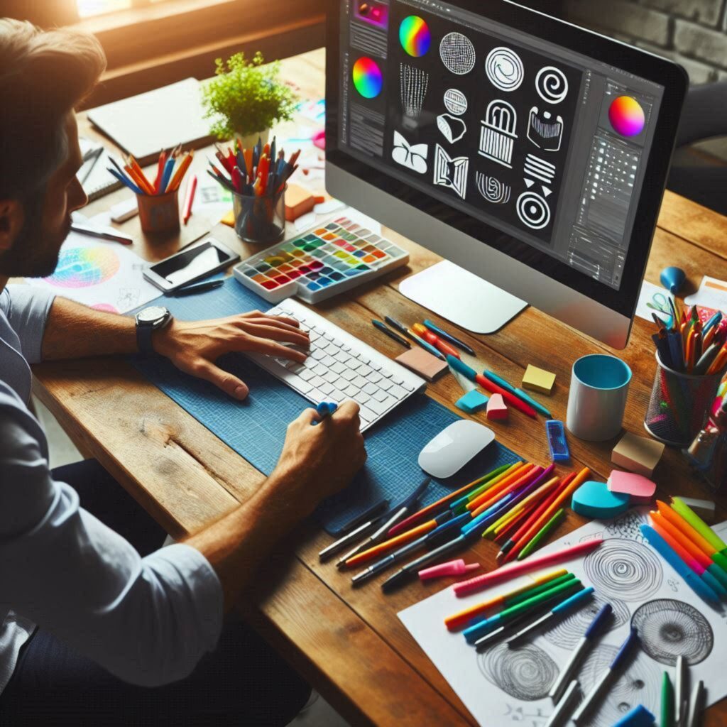
Design is more than just making things look good; it’s a powerful tool that can influence how we think, feel, and behave. The psychology of design taps into human perception, understanding how visual elements can communicate messages and evoke emotions. By leveraging psychological principles, designers can create more impactful and effective visuals. In this blog, we’ll explore how design influences perception and how you can apply these insights to your work.
The Role of Visual Perception in Design
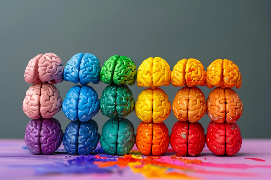
Human brains are wired to process visual information quickly. We often make snap judgments based on what we see, which is why design plays a crucial role in communication. Whether it’s a logo, a website, or an advertisement, the design can shape how we perceive a brand, product, or message.
1. Color Psychology
Color is one of the most powerful tools in a designer’s arsenal. Different colors evoke different emotions and associations. For example:
- Red is often associated with excitement, passion, and urgency. It can stimulate appetite, which is why it’s commonly used in food branding.
- Blue conveys trust, calmness, and stability. It’s frequently used by banks and healthcare companies to build trust.
- Yellow symbolizes happiness, energy, and optimism. It’s a color that grabs attention, often used in marketing to evoke positive feelings.
- Green is linked to nature, health, and tranquility. It’s used in products that promote well-being or environmental friendliness.
- Black represents sophistication, elegance, and power. It’s often used in luxury branding to convey exclusivity.
Understanding color psychology helps designers choose palettes that align with the desired emotional response. The right color choices can reinforce a brand’s message and make designs more memorable.
2. The Impact of Shapes and Geometry
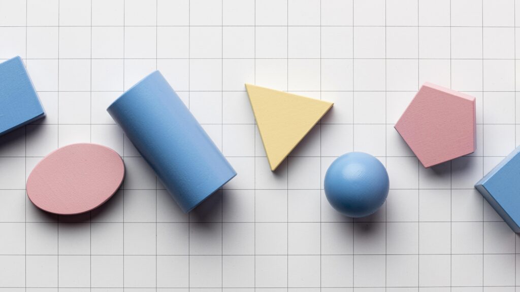
Shapes and geometry also play a significant role in how designs are perceived. Different shapes convey different meanings and emotions:
- Circles and Ovals: These shapes are often associated with unity, harmony, and protection. They can create a sense of community and continuity.
- Squares and Rectangles: These shapes suggest stability, reliability, and order. They are often used to convey professionalism and trust.
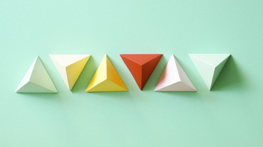
- Triangles: Depending on their orientation, triangles can convey action, movement, or tension. Pointing upwards, they can symbolize growth or ambition, while downward-pointing triangles might suggest danger or instability.
- Organic Shapes: These are irregular, free-form shapes that often feel natural and comforting. They’re used to create a sense of creativity and spontaneity.
By understanding the psychological impact of shapes, designers can craft visuals that subtly influence how people perceive the content or brand.
3. Typography and its Psychological Effects
Typography is more than just choosing a font; it’s about how text is perceived and how it communicates a message. Different fonts evoke different feelings:
- Serif Fonts (e.g., Times New Roman): Often seen as traditional, reliable, and authoritative. They’re commonly used in formal documents and established brands.
- Sans-Serif Fonts (e.g., Arial): Viewed as modern, clean, and straightforward. These fonts are popular in digital design due to their readability on screens.
- Script Fonts (e.g., Brush Script): These convey elegance, creativity, and femininity. They’re often used in invitations or luxury branding.
- Display Fonts: These are decorative and attention-grabbing, often used for headlines or logos. They can convey various emotions, from fun and quirky to bold and daring.
The choice of typography can greatly influence how a message is received. A mismatch between the font style and content can lead to confusion or lack of engagement.
4. The Importance of Visual Hierarchy
Visual hierarchy refers to the arrangement of elements in a way that guides the viewer’s eye to the most important information first. This is crucial in design, as it determines what people see first, what they notice second, and how they process the information overall.
- Size and Scale: Larger elements naturally draw more attention. By varying the size of elements, designers can control the flow of information.
- Contrast: Using contrasting colors or shapes can highlight key elements and make them stand out.
- Positioning: Placing important elements at the top or center of a design ensures they are seen first.
By establishing a clear visual hierarchy, designers can lead viewers through the content logically and intentionally, ensuring that the most critical messages are communicated effectively.
5. The Role of Symmetry and Balance
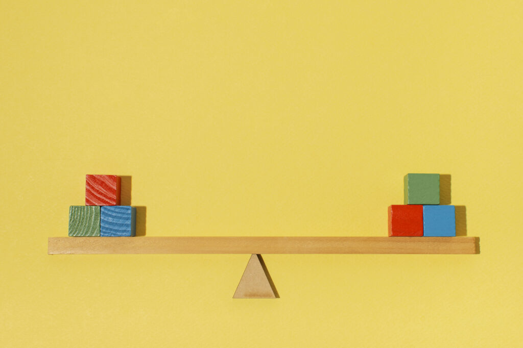
Symmetry and balance are fundamental principles in design that contribute to a sense of harmony and order. Symmetrical designs, where elements are evenly distributed, tend to feel more stable and formal. Asymmetrical designs, on the other hand, can create a sense of movement and energy.
- Symmetry: Symmetrical designs are often seen as pleasing and balanced, providing a sense of calm and stability. They are commonly used in corporate branding to convey reliability.
- Asymmetry: Asymmetrical designs can feel more dynamic and interesting. They’re often used in creative fields where a sense of energy and innovation is desired.
Understanding how symmetry and balance affect perception allows designers to create compositions that align with the desired emotional response.
Applying Psychology to Your Designs
To apply these psychological principles in your designs, start by defining the emotional response you want to evoke. Consider the target audience and the message you want to communicate. Then, choose colors, shapes, typography, and layouts that align with these goals.
Here are a few tips to keep in mind:
- Consistency: Ensure that your design elements consistently convey the intended message. Inconsistencies can confuse viewers and dilute the impact of the design.
- Test and Iterate: Don’t be afraid to experiment with different combinations of design elements. Gather feedback and refine your designs based on how they are perceived.
- Keep the Audience in Mind: Always design with your audience in mind. What works for one group may not work for another, so tailor your designs to the specific preferences and perceptions of your target demographic.
The psychology of design is a fascinating field that reveals how visual elements can shape perception and influence behavior. By understanding the psychological impact of color, shapes, typography, hierarchy, and balance, designers can create more effective and emotionally resonant designs. Whether you’re a professional designer or a non-designer looking to improve your visual communication skills, applying these principles will help you craft visuals that not only look good but also communicate powerfully.

- The Art of Storytelling Through Graphic Design - January 28, 2026
- Why Branding Matters: A Designer’s Perspective - December 30, 2025
- How to Stay Organized While Juggling Multiple Design Projects - December 1, 2025
0 Comments