
")
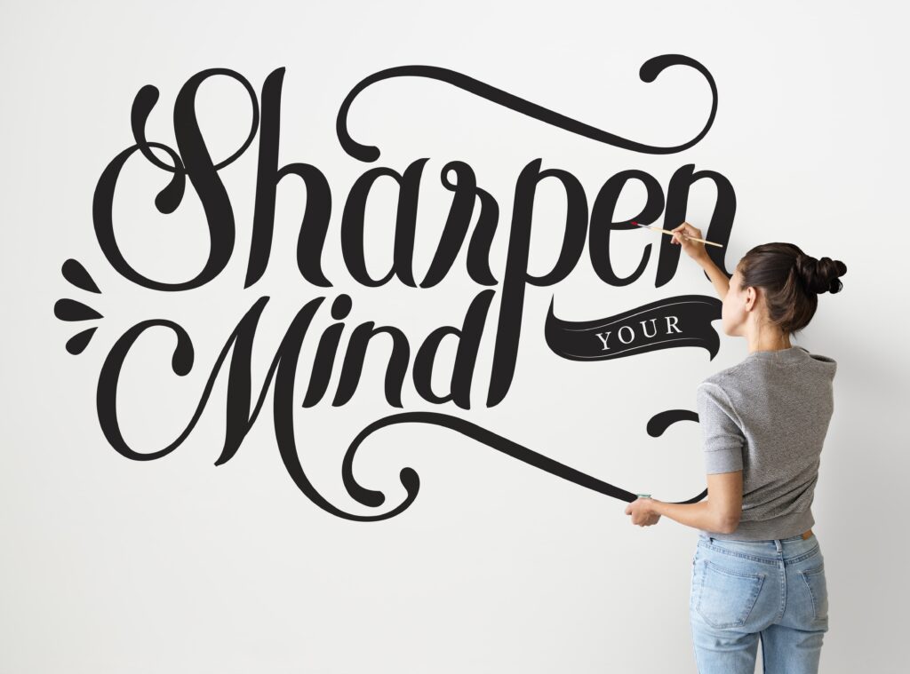
Typography is one of the most powerful yet often underestimated tools in visual communication. Beyond words and letters, typography sets the tone, emotion, and personality of a brand. The typefaces a company chooses are not mere aesthetic choices; they are strategic decisions that influence how people perceive and connect with a brand. In an age where audiences are bombarded with visuals every second, typography plays a crucial role in helping brands stand out, remain consistent, and communicate their values effectively.
Understanding Typography as a Brand Element

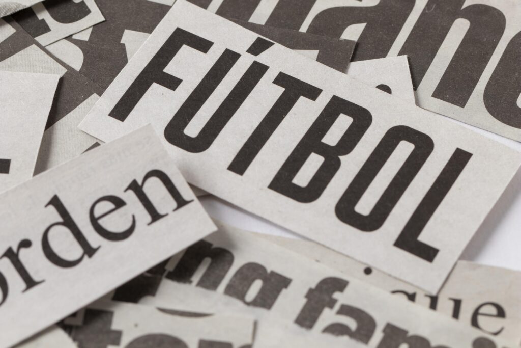
Typography is more than selecting a font that looks good. It’s about crafting a voice through design. Each typeface carries its own emotional weight, cultural associations, and visual rhythm. Serif fonts, for example, evoke tradition, reliability, and sophistication. Sans-serifs feel modern, clean, and approachable. Script fonts convey elegance or creativity, while bold, geometric fonts project confidence and innovation.
When designers choose typography for a brand, they are defining part of its DNA. The typography must align with the brand’s story, target audience, and positioning. It becomes a visual language that customers can recognize instantly, even without the logo. Think about Coca-Cola’s flowing script, Apple’s sleek sans-serif, or The New York Times’ authoritative serif. Each of these brands uses typography as a core identifier that reinforces its voice across every medium.
Typography as a Reflection of Personality
Every brand has a personality, whether it’s bold, playful, elegant, or minimalist. Typography helps express that personality visually. When the typography is consistent with the brand’s tone, it creates harmony between message and form. If a luxury skincare brand uses overly casual fonts, it might feel unrefined. If a tech startup uses ornate typography, it could come across as outdated.
Typography should speak the same language as the brand’s message. For instance, a modern fintech company might choose a clean, sans-serif font that communicates trust and simplicity. A boutique coffee brand might lean toward a hand-lettered or serif font to suggest warmth and craftsmanship. The key is coherence. When type choices and brand values align, the brand feels authentic and intentional.
The Role of Hierarchy and Readability

Good typography is not only about visual appeal; it’s also about communication clarity. Establishing typographic hierarchy guides the viewer’s attention, helping them navigate information in a logical and comfortable way. Font size, weight, spacing, and color all play a part in creating this hierarchy.
A strong brand system uses typography to make content accessible and easy to read. This applies across mediums, whether it’s a billboard, a website, or a product label. Designers must ensure legibility in various contexts, sizes, and devices. Readability reinforces trust. When people can effortlessly read and understand your message, they subconsciously associate your brand with professionalism and reliability.
Typography and Consistency Across Touchpoints
![]()
Typography is a critical component of brand consistency. A brand’s type system, including its primary and secondary fonts, weights, and spacing, must be applied cohesively across all platforms. This consistency helps build recognition and trust. When customers encounter the same typographic style on packaging, social media, advertisements, and websites, they develop a sense of familiarity and connection.
Consistency also extends to tone. For instance, using the same font family but adjusting its weight and color for different contexts allows the brand to maintain coherence while still adapting to various communication needs. Over time, consistent typography becomes a signature that audiences can recognize at a glance.
The Emotional Impact of Typography
Typography has an emotional impact that goes beyond words. It sets the mood and shapes perception before the audience even reads the message. A strong, bold font commands attention and conveys authority. A rounded, soft font feels friendly and nurturing. The psychological effects of typography are subtle but powerful, influencing how audiences feel about a brand.
This emotional dimension becomes even more important in digital environments where audiences interact with brands visually and instantaneously. In these contexts, typography functions as both form and feeling, guiding how people experience the brand in seconds.
Balancing Creativity and Function
Typography gives designers an opportunity to be creative, but creativity must always serve function. Experimental typography can be striking, but if it sacrifices readability or misrepresents the brand, it loses its effectiveness. The best design finds balance, creating a type system that feels unique and expressive while remaining functional and accessible.
Designers can push boundaries by customizing fonts, adjusting kerning and spacing, or creating unique typographic treatments that add distinction. However, every creative choice should align with the brand’s purpose and audience. The goal is not to impress with complexity but to communicate with clarity and character.
The Role of AI in Typography Design
AI has started to influence the field of typography. Tools can now generate type combinations, assess contrast ratios, or even recommend fonts based on tone and emotion. Some AI platforms can create entirely new fonts or analyze audience reactions to typographic styles. These capabilities can save time and provide valuable insights, especially during the exploration phase of a project.
However, AI’s understanding of design remains functional, not emotional. It can process data but cannot fully grasp context, cultural symbolism, or the emotional nuances that make typography meaningful. A human designer knows when a font “feels right” because of intuition, lived experience, and understanding of human psychology.
Designers have a unique advantage over AI because they can tell stories through type. They can interpret subtle cues, anticipate emotional reactions, and craft typography that resonates beyond metrics. AI can support the process by suggesting, optimizing, and automating, but it cannot replace the creative intuition that defines great branding.
Building a Typographic System for Your Brand
Creating a strong typographic foundation requires more than selecting a few fonts. It involves developing a cohesive system that works across all applications. Designers should consider:
Primary Typeface: Represents the core identity of the brand.
Secondary Typeface: Complements the primary font and adds flexibility.
Font Weights and Sizes: Establish hierarchy and tone.
Spacing and Alignment: Maintain visual balance.
Accessibility: Ensure legibility for all users, including those with visual impairments.
Documenting these elements in a brand guide ensures that everyone, from designers to marketers, applies them consistently.
Conclusion
Typography is the visual voice of a brand. It communicates values, shapes perception, and strengthens recognition. When used intentionally, it transforms words into experiences and makes brands feel human, relatable, and trustworthy. While AI continues to evolve, it can only enhance, not replace, the artistry and intuition that human designers bring to typography.
A well-chosen type system does more than look beautiful. It builds a bridge between brand and audience, speaking a language that transcends words. In an era where authenticity matters more than ever, typography remains one of the most powerful tools designers have to craft meaningful and lasting brand identities.

- Why Branding Matters: A Designer’s Perspective - December 30, 2025
- How to Stay Organized While Juggling Multiple Design Projects - December 1, 2025
- The Role of Typography in Creating a Brand Identity - November 6, 2025
0 Comments