

Walmart has always been a household name in retail, known for its low prices, wide selection, and convenience. However, as consumer expectations shift and digital engagement grows, Walmart has decided to refresh its brand identity. The company recently introduced a new logo, featuring a sleek, modern font and bolder colors. This change isn’t just a cosmetic update—it’s a strategic move that reflects Walmart’s push toward a more digital-friendly, contemporary, and engaging shopping experience.
But how is this rebranding affecting its clientele? I’m gonna tell you what I think about the new Walmart’s look, the reasoning behind it, and how customers are responding to this transformation.
What’s New in Walmart’s Branding?
Walmart’s updated branding is subtle yet impactful. Here’s what’s changed:
1. A New Font: Modern and Digital-Friendly
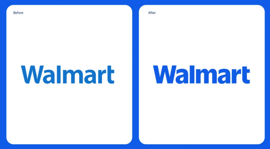
The previous Walmart logo featured a simple sans-serif font that was clean but somewhat plain. The new font has a softer, more rounded look, making it more inviting and user-friendly. This tweak aligns with modern design trends and enhances readability across digital and physical platforms.
With e-commerce playing a bigger role in Walmart’s future, the brand needed a typeface that looks just as sharp on a smartphone screen as it does on a storefront. The updated font gives Walmart a fresher, more contemporary identity while maintaining the familiar feel that customers trust.
2. Bolder Colors for a Stronger Impact
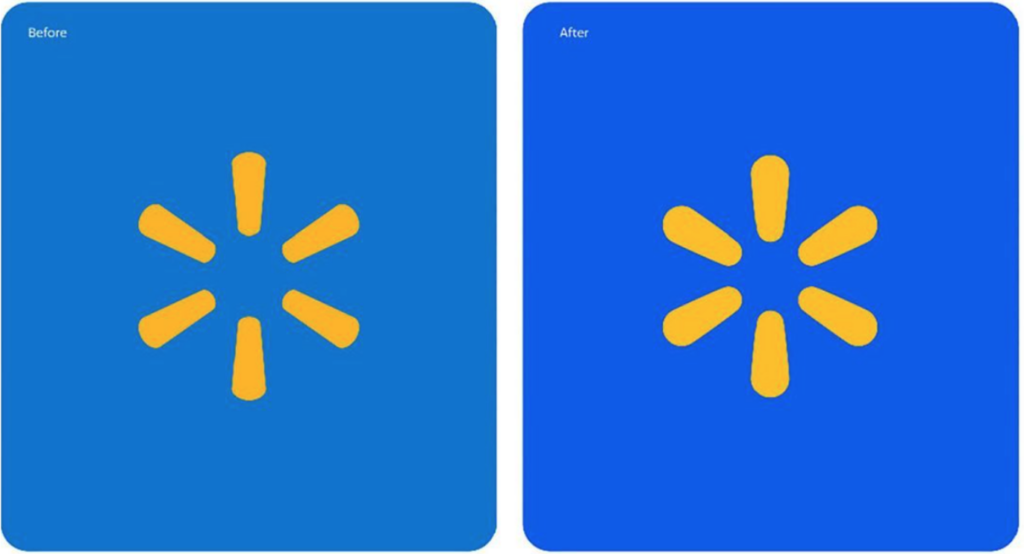
Walmart’s signature blue has also been enhanced. The new branding features a deeper, richer blue, making the logo stand out more vibrantly. The iconic yellow spark symbol remains but appears more refined and energetic, reinforcing Walmart’s friendly and approachable image.
Color psychology plays a key role in branding. The deeper blue conveys reliability, trust, and professionalism, while the bright yellow adds warmth and positivity. This combination helps Walmart maintain its strong brand recognition while modernizing its overall appeal.
Why Did Walmart Rebrand?
Walmart’s rebranding isn’t just about aesthetics—it’s a strategic move designed to align with the company’s growth and evolving customer base. Here are a few key reasons behind the update:
1. A Stronger Digital Presence
As more customers shift to online shopping, Walmart has been investing heavily in e-commerce. A modernized logo and font help the brand stand out in a crowded digital landscape, making it more appealing and recognizable on websites, apps, and advertisements.
2. Competing with Modern Retail Giants
Retail competitors like Target and Amazon have well-defined, sleek branding that resonates with younger consumers. Walmart’s refresh keeps the brand competitive, ensuring that it appeals to both long-time customers and the next generation of shoppers.
3. Enhancing In-Store Experience
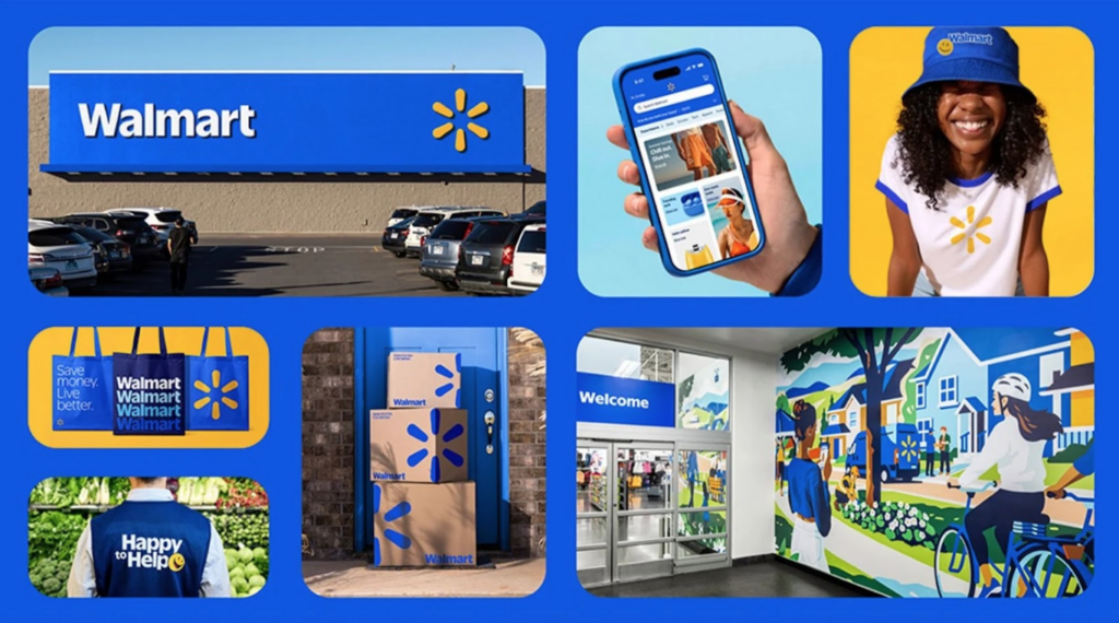
The branding update is also reflected in Walmart’s stores, where new signage and visual merchandising create a more engaging, modern shopping atmosphere. By unifying its physical and digital presence, Walmart ensures that customers have a seamless experience no matter how they choose to shop.
How Customers Are Responding to the New Look
So, what do Walmart shoppers think about the rebrand? Here are some key takeaways from customer reactions:
1. A Fresh, Modern Feel
Many customers appreciate the modern touch. The new font and colors make Walmart look more polished and inviting, particularly for younger audiences who are drawn to clean, digital-first designs.
2. Stronger Brand Recognition
The deeper blue and refined spark icon help Walmart stand out more, especially in online marketplaces where branding needs to be instantly recognizable. Customers have noted that the new logo looks more professional while still feeling familiar.
3. Some Resistance to Change
As with any brand refresh, some long-time customers are hesitant about the update. However, because Walmart’s core elements remain the same, most shoppers quickly adapt to the new look without feeling disconnected from the brand.
The Future of Walmart’s Brand Identity
Walmart’s rebranding is more than just a facelift—it’s a sign of where the company is headed. By refining its visual identity, Walmart is positioning itself as a forward-thinking, customer-first retailer that balances affordability with modernity.
As Walmart continues to evolve, expect to see further enhancements in its in-store and online experience. The new branding sets the stage for future innovations, whether through improved app design, enhanced customer service, or more personalized shopping experiences.
Walmart’s updated branding may seem like a small change, but it plays a big role in shaping customer perception. The refreshed font and colors reflect a more modern, digitally savvy Walmart—one that’s ready to compete in today’s fast-paced retail landscape.
For customers, this means a more visually appealing shopping experience, whether in-store or online. And as Walmart continues to innovate, its branding will likely remain a crucial element in how the company connects with and serves its loyal shoppers.
What do you think of Walmart’s new look? Does it enhance your shopping experience? Let us know in the comments! Take a closer look at the branding guide, Click Here.

- The All-New Affinity: A Creative Game Changer for Our Marketing Team - November 13, 2025
- HubSpot vs. Mailchimp: Which Marketing Platform Is Best in 2025? - September 24, 2025
- Why Human Creativity Still Reigns: 5 Skills AI Can’t Replace (and How to Double Down on Them) - August 29, 2025
0 Comments