

The number of people who access the internet via mobile devices is on the rise. It is important to meet your audience where they are, for many people that place is on a mobile browser. 52.3 million people in the United States access the internet via only mobile devices. In addition to just mobile browsing, more and more purchases and other goal conversions are being completed via mobile browsers and applications. By 2025, more than ten percent of all retail sales in the United States are expected to be generated via mobile commerce. Even if a final purchase does not occur online, a user will likely compare multiple products from different brands on their mobile device before making a purchase decision. This means that even if you are primarily a brick-and-mortar retailer, there is a high chance that clients have visited your website on their smartphones before visiting your storefront.
Having a poorly designed mobile website can take away from the user experience and lead to a higher bounce rate for users accessing the site via their mobile device. Having a poorly performing mobile website can also impact your brand’s credibility as users may judge the quality of your products or services on the quality of your website. Websites that perform well on mobile browsers are also more likely to rank higher on search engine results pages like Google.
Tips for Mobile Optimization
1. Larger Buttons
When using mobile devices to browse the internet, users have traded their ultra-precise little mouse in for their much larger pointer fingers and thumbs. Making sure links and buttons are larger for mobile use is a great way to prevent users from clicking on the wrong things and becoming frustrated with your website. For navigation menu buttons and links, it is best to use a collapsible hamburger-style menu with the navigation headings displayed in a vertical list as opposed to the traditional desktop-style horizontal menu across the header.
2. Design the Mobile Site in a Task-Oriented Fashion
What onsite tasks does a user need to complete in order to accomplish the goals you have set for your site? Make sure these tasks are straightforward and easy to complete with your mobile design. For example, if your goal is to direct more users to your physical location, it would be helpful to make sure the map and directions are prominently displayed and easy to click on. If your goal is to increase mobile e-commerce sales, it would be helpful to make sure the product listings, add-to-cart process, and final checkout process are all easy to navigate to and easy to use on smaller screen sizes.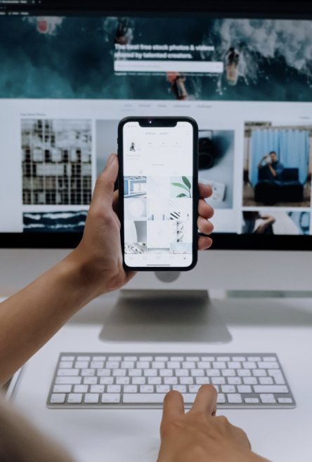
3. Account for Multiple Different Screen Sizes
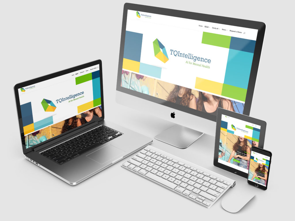
Your design should automatically resize and fit for multiple screen sizes. It is important to know the average screen size for popular browsing devices. If you only design at the average desktop and average smartphone screen size, it is likely that your site will appear jumbled or broken at any in between sizes such as on tablets or larger smartphones. It is important to check your website on as many different devices as possible to ensure the site not only looks good, but functions properly at each screen size for which it will be accessed. Working with a professional web designer and developer is a great way to make sure your website design is responsive.
4. Test Your Site Using Google’s Mobile-Friendly Tool
It is important to check how your site works on mobile browsers whether it is a new website or one that has been active a while. You can use Google’s Mobile-Friendly Test to check your website’s mobile functionality. This is an incredibly helpful resource from Google that allows you to test how well your site works for a user on a mobile device. All you have to do is enter the page’s URL to see how well your page scores.

- Understanding the Online Marketing Funnel - July 23, 2025
- 5 Simple Ways to Get More Sales from Your Email List - June 24, 2025
- 6 Tips for a Successful Meeting Presentation - May 9, 2025
0 Comments