

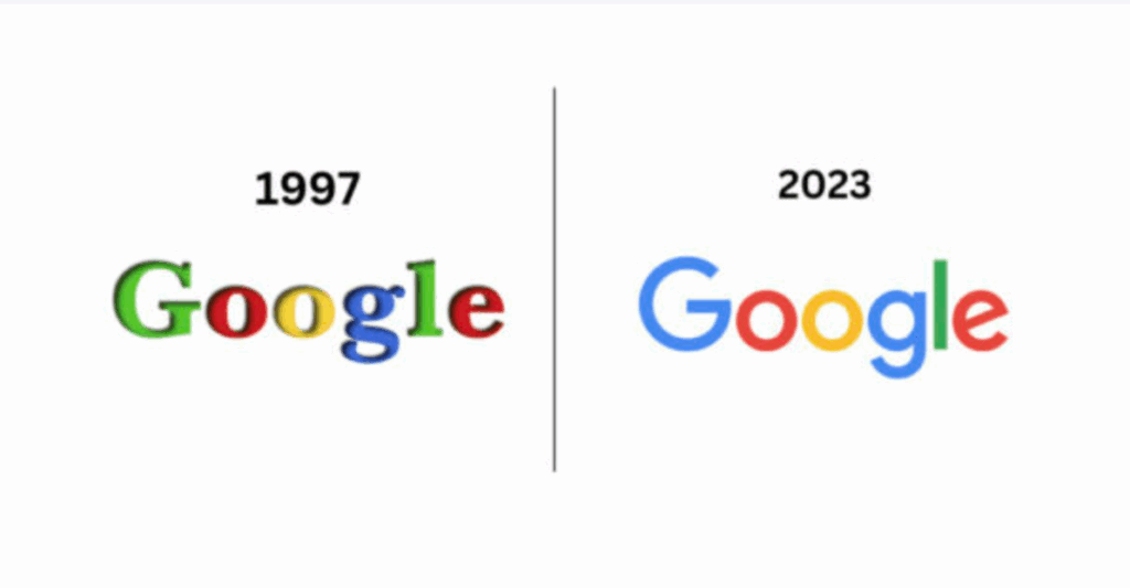
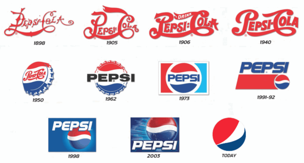
If you look at any major brand’s logo over the last decade, you’ll notice a clear pattern: everything is getting simpler. Logos that once had personality, detail, and texture are being stripped down to flat designs and clean fonts. Think about Google’s shift from its playful serif to its current minimalist sans serif or Pepsi’s refresh built for digital screens. Across industries, the message is the same, less is more.
But this isn’t just about design preferences. Logo simplification reflects bigger cultural, psychological, and technological shifts. It shows us how people connect with brands in a digital-first world, how we navigate constant stimulation, and how branding has adapted to a more global identity.
From Bold and Unique to Flat and Universal
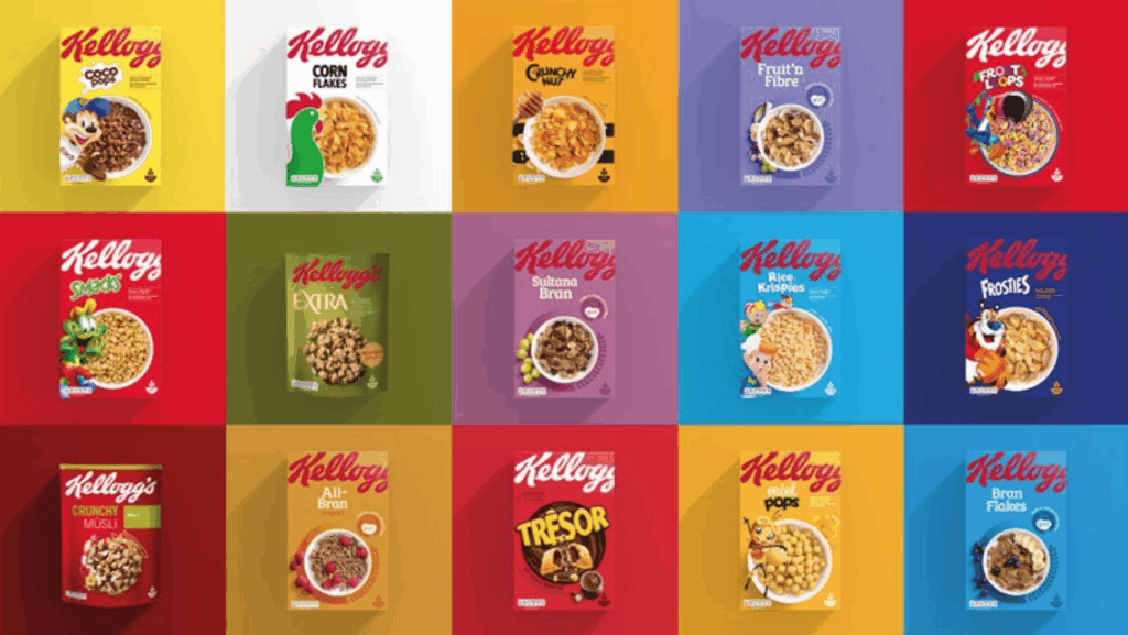
In the 70s, 80s, and 90s, logos were colorful, detailed, and full of personality. Cars stood out, homes were decorated with bold patterns, and clothing leaned into individuality. Even packaging, like soda cans and cereal boxes, had flavor both literally and visually.
Today, branding is far more neutral. Flat design has become the standard, bold colors are often muted, and playful logos are replaced with minimalist marks that scale easily across app icons, websites, and international markets. It’s not accidental—it’s the natural outcome of design needing to be simple, flexible, and universal.
The Psychology of Minimalism
We live in a world of constant noise: social feeds, nonstop news, and endless ads. Minimal logos cut through that noise by signaling calm, modernity, and trust. At the same time, global sameness plays a role—complex logos risk alienating audiences across cultures or aging too quickly.
But there’s a tradeoff. When everything is stripped down, brands risk blending in. What used to be a distinct identity can now feel interchangeable.
Cracker Barrel’s Backpedal: When Nostalgia Wins
Cracker Barrel learned this the hard way. After testing a more simplified logo, the brand faced heavy backlash from loyal customers. Some speculated that political pressure sped up the reversal, but the bigger takeaway is this: people form emotional attachments to logos. When a redesign feels too sterile, it can come across as erasing history.
Simplicity Done Right vs. Oversimplification
Advertising legend David Ogilvy once said branding should be so simple that even a toddler can recognize it. But the goal isn’t to erase character—it’s to make the story clear.
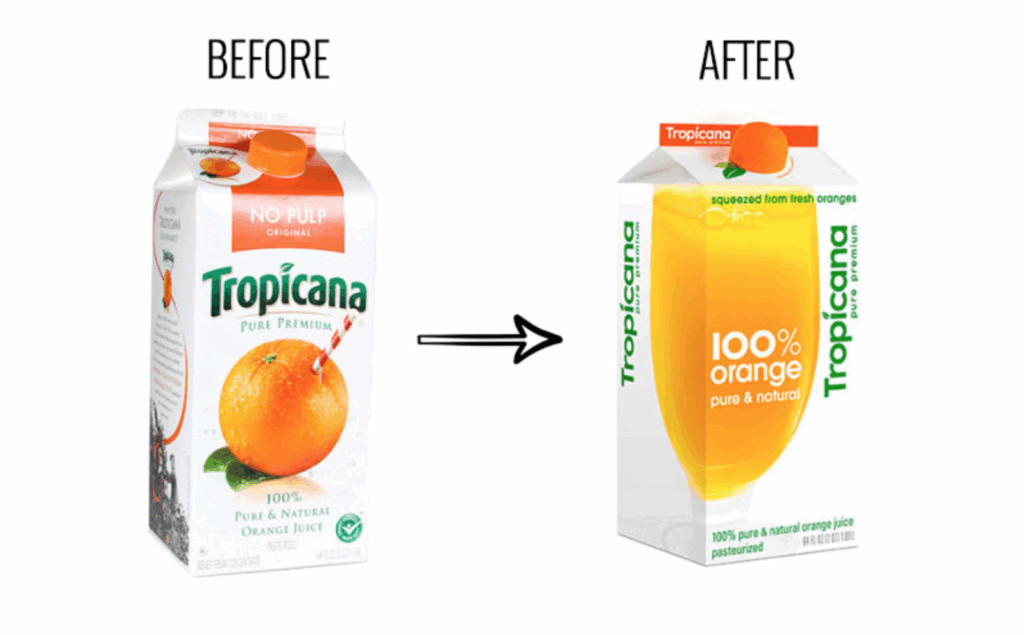
That nuance often gets lost. When simplicity sharpens a brand’s message, it works. When it erases what makes the brand memorable, it fails. Tropicana’s infamous 2009 rebrand is the perfect example: by removing its signature orange-with-a-straw imagery, it confused customers, caused sales to drop 20% in two months, and was quickly scrapped.
Logos as Cultural Markers
Today’s sleek, minimal logos mirror a world obsessed with efficiency, scalability, and global accessibility. They’re also a response to overstimulation—when everything feels loud, minimalism feels refreshing.
But the downside is a loss of individuality. Just like cars, fashion, and interior design, logos are becoming safer and less daring. And in that safety, something powerful about bold design risks getting lost.
The Future of Branding
Minimalism isn’t disappearing anytime soon, but we’re starting to see a renewed appetite for personality in design. In crowded markets, storytelling, texture, and detail may be what set brands apart.
Ultimately, branding isn’t about following trends—it’s about clarity. Whether a logo is simple or intricate, it has to connect emotionally and instantly. Because at the end of the day, a logo isn’t just design—it’s culture in visual form.

- How AI Is Reshaping Paid Ads - October 16, 2025
- Champagne Branding On A Long Island Iced Tea Budget - September 24, 2025
- Everything Is Starting to Look the Same… Even Logos. - September 4, 2025
0 Comments