This blog is a continuation of my previous blog “What Makes a terrible Logo” and you can read that here.
3. Poor Typography
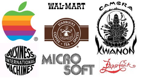
Typography has become a huge part of logo design today and it is the art of arranging letterforms to make written language legible and appealing when displayed. It is used to display the name of your brand while echoing the look and feel of the brand. There are millions of typefaces out there and they can be classified into four groups. Serifs, Sans Serif, Script and Decorative. A deeper look into these categories would give you a better understanding of what typefaces would be ideal for your logo. For example, most brands within the high fashion industry use Serif typefaces within their logos due to the neoclassical look and feel of serifs. Brands within the tech industry usually have San Serif-type styles due to the geometric nature of typefaces within this category. The wrong choice of typeface usually leads to a poorly designed logo and one of the best ways to avoid this is to first look into typefaces trends within the industry of your brand. Take note of the design decisions that have been made with the typeface choice in relation to the identity of the brand and let that guide you on your journey to picking the right typeface for your brand.
The use of multiple fonts could also result in a badly designed logo. As mentioned earlier, the typography echoes the look and feel of your brand therefore, the use of two or more different typefaces often leads to confusion with regards to the ideas you might be trying to convey with your brand identity. With that being said, try your best to stick to one typeface that embodies your brand characteristics when designing a logo.
4. Wrong Use of Color
Just like Typography, color also contributes to the look and feel of your brand. Different colors convey different emotions, for example, grey could mean sad, yellow usually translates as bright and happy and green could represent energy or growth. The predominant colors within the fast-food industry are red and yellow. These colors are used to influence potential customers on a psychological level. Yellow evokes the feeling of comfort while red tends to make people feel hungry and impulsive. Marketing experts usually refer to this pairing as the “Ketchup and Mustard Theory”. Recently, Burger King redesigned their logo after 20 years and they removed the blue from the old logo. This decision was made based on the idea that “there’s no blue food,” according to Global Chief Marketing Officer Fernando Machado. Also “Buns don’t shine” so that was also changed and these decisions helped to create a more modern and refined look for the brand. Therefore when designing a logo, think about how you want people to feel in relation to the characteristics of your brand and this would help you in picking the right colors for your brand.
5. Raster Graphics
What are raster graphics? If you pay for a logo and someone gives you anything that looks like the image below kindly ask for a refund.
If possible, file a lawsuit. It’s a sin. Okay, it’s not but do not accept it. Raster graphics are bitmaps and they are a grid of individual pixels that collectively compose an image. They render images as a collection of countless tiny squares. Raster graphics look amazing at their original size however they produce tiny pixelated edges when scaled up resulting in a blurry image. Due to this, they cannot be used on bigger surfaces like vehicles, billboards, or even as a decal in your office. Raster graphics usually come in JPEG and PNG formats hence if you need to produce a deliverable at a larger scale, opt for vector graphic file formats. These can be produced in AI (Adobe Illustrator) EPS or SVG file formats.
With all this being said, I hope you make the best decisions when designing a logo or hiring someone to design your logo.
Read more blogs from The Kool Source.
- The Art of Storytelling Through Graphic Design - January 28, 2026
- Why Branding Matters: A Designer’s Perspective - December 30, 2025
- How to Stay Organized While Juggling Multiple Design Projects - December 1, 2025


0 Comments